The user portal is a very powerful and streamlined interface. It is laid out as simple as possible to make it easy for the user to navigate. One note before we start. The only time a user can make changes to their account is to message you. This includes the following:
• Their Name
• Their address information
• Their phone number
• Their email
• Their Route
• Their mailing address
• Their Birthday
The reason for this is because these are integral parts that the system relies on and if we give everybody the opportunity to change these things without you being notified then it would cause confusion. Additionally, this also helps keep the accounts secure.
The user can see all the above information except for their birthday.
Overview
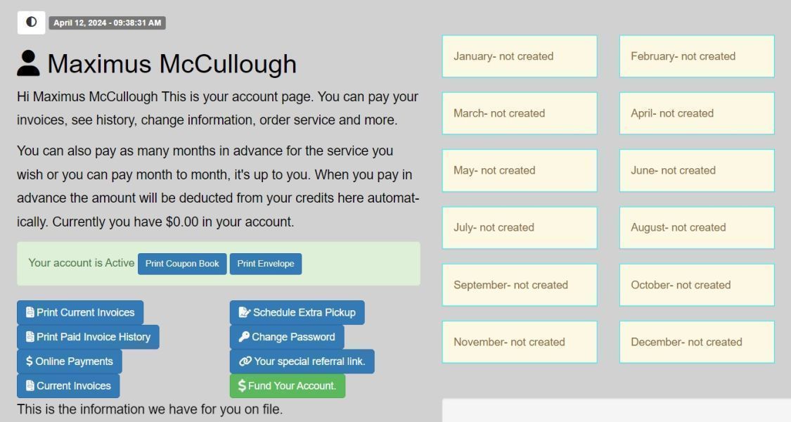
Upon their initial login, users are directed to the primary landing page, serving as the gateway to the comprehensive array of site features. This welcoming interface is designed to provide an efficient and accessible starting point for their navigation.
At the top of the page, users can stay informed and engaged by accessing recent company news posts, ensuring they are up to date with the latest developments. They can seamlessly explore listings created by other users, presenting a diverse range of items.
Furthermore, from this central page, users have the option to log out of their account or initiate communication through the site's messaging feature. Their financial interactions are neatly organized, with a quick view of their invoices and payments.
Additionally, an intuitive search function is available, empowering users to swiftly locate specific items or information they may be seeking, thus enhancing their overall experience and productivity within the platform.

Within their user portal, users have a multitude of features at their fingertips, all accessible from their primary landing page. This central hub has been meticulously designed to provide a convenient and user-friendly starting point for their site exploration.
Users can access valuable tools such as the ability to print a yearly coupon book or customize envelopes bearing the company's name and address, complemented by their own return address. This feature enhances the user's interaction with the company and optimizes branding.
Furthermore, users can conveniently delve into their financial history by accessing their invoice history, enabling them to view and print both past and current invoices effortlessly. They also have the capability to reach out to management or make alterations to their account settings, including changing their password for enhanced security.
In addition, users are empowered to expand their engagement by sharing a unique referral link with potential new customers. This initiative rewards them with credit for each successful referral, encouraging them to play an active role in growing the user community and reaping the benefits.

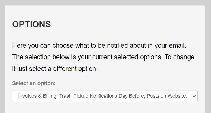
As we scroll down the page a user can select what they want to be notified of in their email. Here are the choices.
1. Invoice and Billing Only
2. Invoice and Billing and Trash Pickup Reminder
3. Invoice and Billing, Trash Pickup Reminder and Posts on Websites
4. Invoice and Billing, Trash Pickup Reminder, Posts on Website and User Listings

As we scroll down further on the user portal they are given the opportunity to list an item if they wish. Furthermore, if they already have items they listed they can manage them by clicking the links that are provided for each listing.

As we go down further on the user portal we arrive at a place where the user can place advertisements. To see this process in detail see the advertisement section. However, the user is given the opportunity to place ads on the platform to reach a large audience. The user can decide how much they want to spend on an advertisement.
That pretty much wraps it up on the user portal. We tried to keep it simple for your customers and create an engaging and satisfying experience for all involved.
